
Denomination, together with packaging company, Cerve Spa, have created a new and unique packaging solution for Opal Nera.
Premium Italian liqueur Opal Nera has relaunched around the world, with brand refresh managed by Denomination.
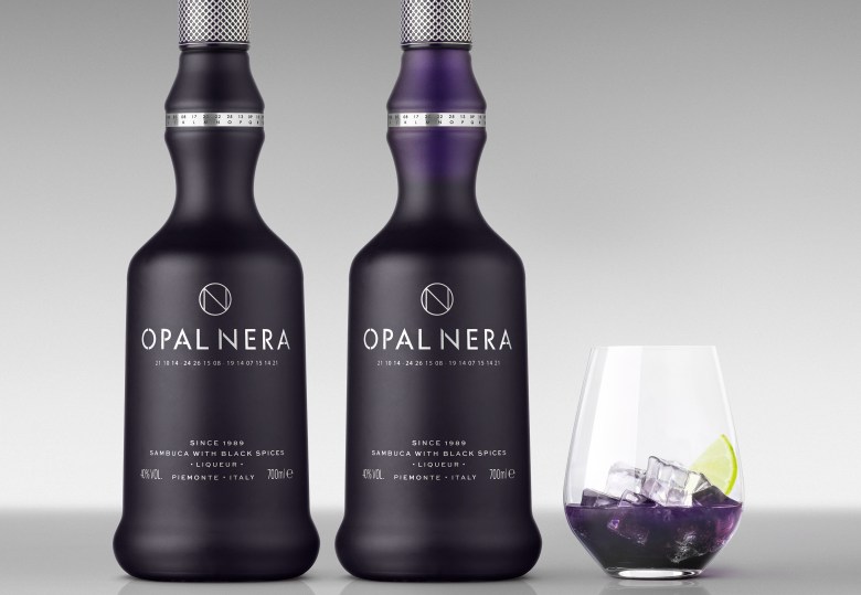
After achieving great success in the 1980s, family-run distillery Gruppo Francoli asked Denomination to create a modern, luxe look ahead of an international push to re-establish the sambuca-based dark liqueur. Opal Nera is made from ten ingredients including elderberries, which give it its purple hue.
Tapping on its distinctive colour, Denomination’s approach to the packaging identity was to modify the bottle to reflect its purple content, according to Denomination CEO Rowena Curlewis.
“Opal Nera’s USP – its ‘dark secret’ – is that it turns purple on contact with ice, so we modified the bottle to reflect that. At first glance it looks like black frosted glass but, on pouring, a purple colour that matches the liquid is revealed as the bottle empties,” she said.
All content was directly screen printed onto the bottle. It was sprayed a dark purple to allude to the colour of the liquid once mixed with ice. The typographic details and logo were screen printed silver.
“The neck label was printed, while the bottle was sprayed with frosted purple coating all over. As for the design, it was screen printed on the back and front,” Denomination said.
“The challenge was to achieve a smooth all over purple coating at the specified pantone colour reference and secondly, to match the silver neck label to the silver on the capsule and the silver on the screen printed bottle surface.
“This was achieved through coordination of the different suppliers and going through a few rounds of test printing.”
Playing on this point of difference, Denomination also added a code beneath the logo, which consumers can decipher using a sequence of letters and numbers that appears on the rim to reveal the words ‘dark secret’.
“We wanted to tell the story in a unique way, and our ‘secret code’ mechanism is distinctive and really engages the consumer,” Curlewis said.
The capsule was made and printed separately.
According to Gruppo Francoli commercial director Nigel Brown Denomination has made Opal Nera relevant to the modern consumer while also keeping the classic bottle.
“Denomination has developed a beautiful design solution that captures people’s attention. It is still recognisably Opal Nera but has been brought up to date so that it will appeal to the modern consumer,” Brown said.
“It’s a sophisticated response that plays to Opal Nera’s distinctive qualities, making it stand out in a sea of conservative brands. We love the way consumers are now drawn in and taken on a journey of discovery, with layered packaging that engages bar tenders and drinkers and makes Opal Nera a memorable experience.”
Comment below to have your say on this story.
If you have a news story or tip-off, get in touch at editorial@sprinter.com.au.
Sign up to the Sprinter newsletter