
I’ve heard people say you have to be a bit mad to be a printer, but is print actually developing a neurological disorder? Yes, the market is depressed, the news of late borders on demented and the spate of closures and pre-packs could make you delirious, but that’s not what I’m talking about.
There’s a phenomenon of the brain called “synesthesia”, where neurological pathways get confused and start senses crashing into each other like tailgaters on unsigned intersections with faulty traffic lights. One classic variety of the disorder is called “colour-graphemic” – mixing up colours with numbers or letters.
Can you see where I’m going with this? Like it or not, the future of print is bound in with rigid colour standards. You’re forgiven if you forget the exact digits, but the inelegantly-named ISO 12647-2 is coming to the industry in a full-blown UKAS accredited incarnation later this year, as it already has in Australia. You’d also be forgiven for thinking it’s just another hurdle to jump through. Another certificate to wave around. But increasingly, buyers are demanding it. And when they say “jump”, printers have to say, “How high?” (and possibly “What is it this time?”).
I’ve been looking into some research on brand colours. Trademark law firm Withers & Rogers reckon marketers should be more vigilant in legally protecting their brand colours (being lawyers, they would say that). In a recent survey, UK brands AA, Easyjet, BP, Cadbury and Royal Mail topped a list for “colour recall”. Whatever the corporate colours, they’re all blue-chip print customers. To win a gold-class client list, printers need to be structured, strategic and, yes, synesthesiac, in their approach to colour.
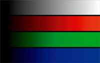
It’s all very well to link colours to Pantone numbers, or delta-E values, or ISO digit. In theory. But what happens when you’re looking at multiple substrates and different processes?
I was talking to Tom Gurd, managing director of Easyjet’s print manager, FT Print, about this. Not only does he have to reproduce that iconic orange on paper, plastics and thermals but increasingly tricksy materials like metal (for those things to check your baggage size) and the materials for head rest covers. No easy matter, but when you’ve got a contract for 107 airports in 27 countries, no doubt you’ll be prepared to do a bit of fiddling to get your separations spot on.
If only that were the end of the matter though. But it’s not. These days, the capital-letter Brand is all-powerful, all-seeing and all-media. Sure, you can do your coated and uncoated, your films and foiled board and pernickety substrates. What about on TV? On a computer monitor? On a mobile phone? On a digital billboard? How can brand owners make sure their precious corporate hue is the same everywhere it appears?
There’s a whole bunch of long answers on how to get around this issue. I remember listening to a leading printer (or rather, marketing communications company) extol the importance of brand cohesion and clarity and consistency. All well and good, so I asked him point blank about how this message of unified colour fits into our cross-media world. He gave the short answer.
It doesn’t. Change the brightness on your screen and the whole idea falls to pieces.
But very clever people with a better understanding of colour and numbers (and probably with letters after their name) will try to find the solution to print’s synesthesia. So while the industry may not have an actual neurological disorder, matching colours in the modern media mix can certainly give you a headache.
Comment below to have your say on this story.
If you have a news story or tip-off, get in touch at editorial@sprinter.com.au.
Sign up to the Sprinter newsletter