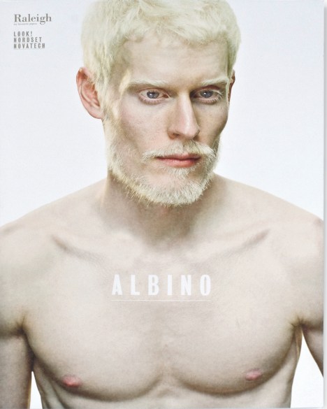
Described by some as controversial, the new tool manages to explore this condition while demonstrating the flexibility and versatility of three distinct super calendared, uncoated, and coated papers – Look!, Nordset, and Novatech.
The three brands offer superior quality, high performance and proven reliability with class leading environmental credentials, the company claimed.
But the theme of Albinism has opened the eyes, and minds, of the company’s clients, said Raleigh marketing manager Rod Williamson.
“When the agency, Yello, came up with the concept, we were unsure,” Williamson said. “But once we saw the images, and the way they were handling the subject so sensitively – it’s really an education piece rather than a piece of overt sensationalism.”
Yello chose this theme on the basis of the link between the products and the meaning of Albinism: from the Latin “albus”, meaning “white”.
The promotional tool uses a variety of techniques and processes to showcase all the papers in different situations. It also sets new benchmarks in production values and technical know-how. It utilises spot UV varnishing, spot foiling, matt and gloss varnishes, different weights, a raft of print processes and finishes from four-colour process, halftones, duotones, bump plates to fluorescent inks.
“It really was something of a labour of love. We’re exceptionally proud of it, and it’s already leaping out the door,” said Williamson.
Comment below to have your say on this story.
If you have a news story or tip-off, get in touch at editorial@sprinter.com.au.
Sign up to the Sprinter newsletter