National trade printer LEP is rebranding in response to the continually evolving print industry, launching a new logo to represent the changed positioning, with the business having gone through an 18-month evaluation of every aspect of its business.
The company says its new corporate hallmark puts the print industry on notice that LEP Colour Printers has no time for complacency. It says that as the print industry takes on board new technology developments to meet the constantly changing demands of its consumers, trade printers have to stay one step ahead, both culturally and technologically, to meet those demands
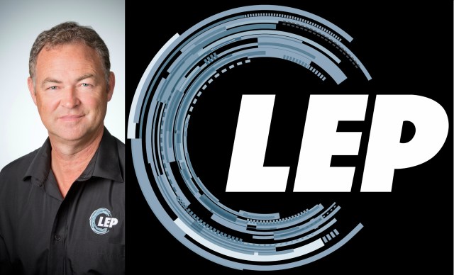
John Bromfeld, CEO at LEP Colour Printers, has been at the forefront of the drive to transform the company during that time. He believes the new logo emphasises the company’s ethos of rigour and innovation in everything it does.
“It is change or get changed out — a challenge that we have taken head-on at LEP”, says Bromfield. “For the last year-and- a-half we have worked intensively with this new ambition, and are now launching the next stage with a new key facet — a brand design that reflects how we want to be perceived in the future, capturing the technical nature of printing, its pulse and speed.”
“To thrive in this new digital world, where business moves faster than ever, we have set out to modernise and elevate LEP, our brand, our shop front, and evolve our online trade printing. We are leading the change in trade print expectations, giving printers what they need to successfully fulfil their customers’ expectations,” says Bromfield.
“We have changed every element of the business to meet the demands our customers have created. We have done that through lean manufacturing, vibrant product and service offerings, and the fastest turnaround times in the country. We are now about to embrace the next transformation in our never-ending journey of continuous improvement in print,” he added.
[Related: LEP slashes brochure turnaround]
The company has launched the new logo to replace its well-known four colour triple-octagon logo, and says the new visual identity is an up-to- the-minute reflection of LEP’s dedication to the use of new technology, and new print techniques, to produce highest quality print products in timeframes that ensure its customers satisfy the expectations of their own clients.
The new logo is a graphic representation of the company’s business vision. It features a contemporary circle that describes the highly technical nature of printing, and uses a colour palette enhancing the typography designed to represent speed and agility.
That is a challenge LEP Colour Printers says it relishes. For the past decade, the company has continually analysed and upgraded every facet of its business, infrastructure and processes to ensure that it is constantly at the ready for new directions in the use of print.
The company says its new logo is a recognisable representation of LEP’s highly responsive customer interaction through its online store, longstanding expertise in digital and offset print technology, and unparalleled job turnaround times.
Bromfeld says, “As printers become familiar with LEP’s new logo, it will remind them of the ongoing developments inside the company which are less visible, but nevertheless play a vitally important role in LEP’s strategic development as the leading trade printer in Australia.”
LEP Colour Printers operates out of two identical sites, one just outside the Sunshine Coast in Queensland and one in Melbourne. Bromfeld is known as pioneer of lean manufacturing the Australian print industry.
Comment below to have your say on this story.
If you have a news story or tip-off, get in touch at editorial@sprinter.com.au.
Sign up to the Sprinter newsletter