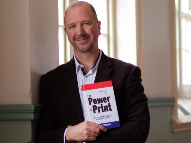
The following is an excerpt from Posterboy Printing founder Daniel Edwards’ book titled The Power of Print
Asking the vital questions – This exerpt includes quotes from successful marketers, Ronald Fernandez from Unilever, and Gwen Morrison from The Store, about how they think marketing artwork should be composed. They provide insights into the thinking of people at the top levels of marketing and visual merchandising.
Developing graphic design essentially means answering a customer’s questions before they have asked them and asking them to do something.
The challenge is in answering as few questions as required and not asking too much. People need to know only enough so they will do what you ask.
More information than the minimum will cloud the message. By leaving information out, graphic design achieves clarity and gives certainty about granting your request. In addressing print design broadly, I believe marketing and visual merchandising artwork must answer three questions.
1. What is for sale?
2. Who is selling it?
3. How can they buy it?
These three questions must be answered fully and clearly or potential buyers won’t buy.
This simplification does not exclude the classic ‘Why?’ It’s a question marketers often focus on – the ‘selling a lifestyle’ approach. Coke ads famously work on the idea that people buy the lifestyle, not the product. I believe the ‘why’ is developed in copy writing, the offer and imagery, although there are better books to read about that concept.
What
Introduce the product and tell the audience about the product for sale. Clear product information will create interest and inspire people to learn more. It can, but doesn’t have to be, a list of features and benefits. Or it may just be an image of the product, as with a Coke ad.
Who
Introduce the business or organisation that is offering the product for sale. Potential buyers need to know the seller because if they don’t know who they are buying from, they won’t buy.
If Warren Buffett, the world’s greatest investor, offered advice on a stock to buy, you would probably buy it. If someone you’d never met before recommended a stock, you probably wouldn’t buy it.
It is surprising how often graphic design includes little or no information about the brand supplying the service. I have seen flyers that didn’t even include the brand’s name. If you include affiliate logos, celebrity endorsements or quotes from reviews, these can help build confidence in the brand. At the very least, list the brand’s name!
There is another aspect to consider when using print marketing. It is said the real meeting happens after the meeting. Customers will discuss and consider a proposal after the sales meeting is over. In that ‘meeting after the meeting’, the physical print artefact will be your only representative in the room.
Elevate the reader’s opinion of the brand by using high-quality paper stocks and production techniques. The approaches to create value, discussed earlier in this book, will all contribute to creating a quality printed product that will make the reader think positively about the brand. It is the equivalent of having a well-presented sales rep. A good print will better arm customers who are on board to convince those who aren’t so sure.
How
The ‘how’ is purely functional and is a combination of the immediate goal and a connection. For example, if the immediate goal is to get the reader to call, the ‘how’ is the phone number – the connection. Other examples of ‘how’ might be ‘go to this website’, ‘walk in this direction’ or ‘go to this shop’.
Use the connections that were mapped out in Chapter 4 and Chapter 5. Emphasise the connection tools for the actions you want people to take but still consider including connections for actions you don’t really want taken, just to expand the reach of the advertisement. The artwork should still serve the reader and allow them to use their favourite channel.
Focus group participants talked about the fact that they valued being able to scan a catalogue that would take them to additional information about a product. Scanning a catalogue to allow for a direct purchase can make the purchase easier by taking the user directly to a web page with more information about that specific product, not the store in general.
— USPS, Enhancing Mail for Digital Natives[i]
Wayfinders
Wayfinders are a real-life, bare-bones example of the three questions being answered in a graphic design. Wayfinders are the permanent architectural signs seen hanging from the ceiling in places like shopping centres, airports and exhibition centres. They direct people to facilities such as toilets, elevators and food courts.
A wayfinder is a visually simple sign that communicates a clear message. People don’t generally think of them as marketing messages but they promote a service by telling people what it is, who is providing it and how to get it – answering the three questions.
A wayfinder will have a symbol indicating what it is directing you to – for example, an elevator, a name on a door or a toilet. It will have a directional arrow showing how to get there. It often shows the logo of the building at the bottom, telling you who is providing the service. A wayfinder might not be branded but the identity of the business is clear because it is permanently attached to the building. All three questions are answered with clarity.
[i] U.S. Postal Service Office of Inspector General. 2013. “Enhancing Mail for Digital Natives”. https://www.uspsoig.gov/sites/default/files/document-library-files/2015/rarc-wp-14-001_enhancing_mail_for_digital_natives_0.pdf.
Comment below to have your say on this story.
If you have a news story or tip-off, get in touch at editorial@sprinter.com.au.
Sign up to the Sprinter newsletter
