There are print jobs and then there are print jobs. The modus operandi of this project, its results and its notoriety have etched a permanent place in Australian print history.
The Body of Work has taken an unprecedented approach to the concept of print marketing. The brainchild of Bob Armstrong, director of annual report design company Armstrong, Miller+McLaren, its main purpose is to showcase print as the medium of choice for those with premium tastes.
And for Armstrong, that meant premium print principles. Nothing is dismissed because of cost or difficulty criteria; the sole criterion for production purposes is quality.
The Body of Work magazine, which is really a coffee table style of book, is in its third year. Its first two editions won numerous print awards in Australia and internationally, adding to its reputation as a benchmark in print, both litho and digital, as it was produced by both processes, and won awards for both.
But it has also has its detractors, who say that it is not an appropriate project to enter in print awards because it is not really a commercial print job. Its “no holds barred” production approach has alienated some in the print community.
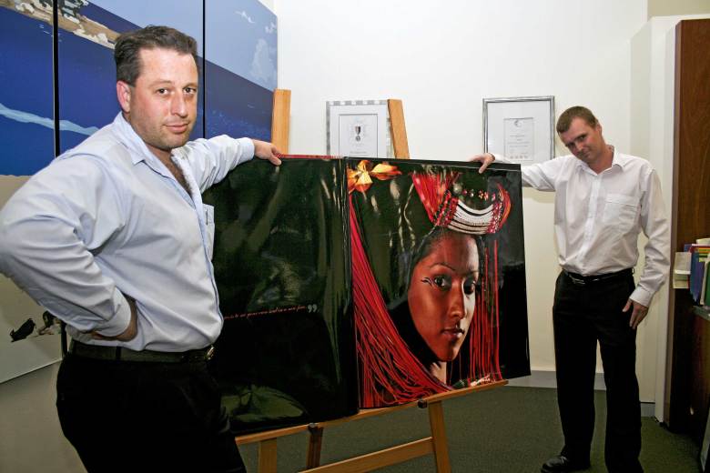
The digital edition was prepared and printed by The Digital Centre in Sydney’s St Leonards. The Digital Centre’s Phil Huxtable (pictured, right) has no hesitation in agreeing that it represents a pinnacle in the company’s history.
“It was produced by Bob Armstrong as a very boutique coffee table book, essentially,” said Huxtable. “It’s been produced in several different styles and formats, from the poster hard case book in our foyer (which was once the largest hard case digital book in the world) through to oversized A5, and it’s been produced with various levels of embellishments, depending on print runs and so on, throughout the book.”
Bob Armstrong knew exactly what he wanted to achieve with Body of Work.
“The whole reason is it’s the first book put out that is a premium quality magazine that only sells premium products,” Armstrong told ProPrint. “It is without compromise, and without any cost restraints, so we just go for it.
“The digital part has been a very important step in the whole thing, because The Digital Centre are the best digital printers in Australia, in my view. The whole Body of Work brand has been built up over three years, and last year the NSW manager of the Printing Industries Association said that it was now the benchmark in print. Last year, it won 32 national and international print awards. It has been entered twice in the Sappi awards and won gold twice.”
The next edition of the book will take a slightly different marketing approach from previous editions.
“We are currently doing Body of Work 6, in conjunction with Trivett, which features premium brands like Rolls Royce, Bentley, Aston Martin, and so on. To market it we have actually printed it exactly the way it will be and sent it to 25 people, and have so far had 25 appointments.
“Everything we do for Body of Work is premium brand, and we’re very demanding. When people see the book done by The Digital Centre they can’t believe it’s digitally printed.”
The approach to the project’s production was unusual. Instead of receiving a creative job, sending it through standard print procedures and on to the offset or digital press hoping to match ISO standards, The Body of Work was devised in reverse from the end result.
“What Bob wanted to do with these is show what print can do, and get a third party opinion of them at print awards,” said The Digital Centre’s production manager, Ashley Risstrom (pictured, left).
“To do that he wanted to produce books that are of incredible quality. He coupled his interest in photography to create images by using press profiles and taking those right up to the camera, so when he shot the images he knew he was going to get the absolute quality he wanted in the final piece. What I had to do was get the press profiles and bring them all the way through the process, into Photoshop for the conversion to CMYK, right up to the camera.
“The other component in it was pushing the envelope. Pushing the envelope involved printing on silver, using sculpture emboss, spot UVs, tonal spot UVs, all the different coatings you can get, including scent coats, matte coats, and a lot more.
Risstrom then makes a confession: “The first edition of the book has won international and national print awards, but I didn’t think it was as good as we could do. At the time it was, but now it isn’t, with things like utilising the full gamma of our digital press, versus trying to print as an ISO standard to match sheetfed print.
“So that’s why in this more recent version of the book I changed the workflow from a CMYK workflow to a full RGB workflow. Now what we’ve got is a hell of a lot more vivid colours and we’ve actually done better than any litho print could ever do. The original book is to show that digital printing is as good as litho printing. I then wanted to do better, so now I’ve produced a job that’s better than litho. The proof is here. I can put it next to the same job in litho, an award-winning litho product, and with the same image next to it in digital you can see immediately that the digital is better, with more detail using the full RGB gamma.”
Reverse workflow
This project has fired Risstrom up to take the process of “reverse workflow” further.
“There are jobs that I’d like to do in RGB, and I actually want to change the way the industry thinks about having a digital press and matching ISO in sheetfed. Digital can do better colour than litho, so why don’t we deliver the best we can for our clients? If you need something that’s going to match a litho job, fine, we’ll match the litho job with an ISO run, but if you want a job done to reproduce Pantone colours, with an RGB workflow I can get much closer to the Pantone colour than I’ll ever get with CMYK. If we only have to match the CMYK interpretation of Pantone, that’s easy.
“I intend to make the default workflow in this company an RGB workflow. People in the industry say: ‘Yes, we’d like to go that way too’. The workflow that should be in place should be RGB files the whole way through from photography to creation, and only be converted to the output colour space at the point of output.
“So you should be able to have the same files and point it to a web press, a sheetfed press or a digital press, and only at that point is it converted to what the machine can produce. I want the workflow here to be RGB to utilise the full gamma of the digital press and our large-format printers.
“It’s not hard. It’s almost harder to just match an ISO standard than it is to produce best colour.”
It pays to print
Phil Huxtable has no doubt about the value of being involved in a project like the Body of Work. “This book is really selfpromotion, for everyone involved to showcase their abilities. It certainly gives us an ability to show clients what we can do. We can say, ‘this is what we have done’. Bob wanted it to say ‘Nothing sells like print’. It certainly does that.”
Comment below to have your say on this story.
If you have a news story or tip-off, get in touch at editorial@sprinter.com.au.
Sign up to the Sprinter newsletter