When it comes to branding – from a company logo to a website – few printers are setting the design world alight with their own corporate identity. You know the approach: tech-heavy online home pages jammed with PDF specs and detailed equipment lists; letterheads bearing motifs that belong to an age gone by; signage in sore need of some TLC. The irony, of course, is that these same print houses make their customers – marketers, design agencies, publishers – look good. Yes, the client must come first, but the supplier needn’t trail behind.
Southern Colour Victoria managing director Rod Dawson admits his company’s brand wasn’t borne out of the ideal design environment when the company relaunched nine years ago. Dawson had just led a management buyout of the Keysborough, Melbourne-based commercial house. Its then dire financial position was the main driver behind the change at the top. As incoming managing director, Dawson’s main focus was paying off large debts, winning back the hearts and minds of suppliers and bedding in the new regime. New company stationery wasn’t foremost on the to-do list. That’s not to say there was something wrong with the new brand, just that there were more pressing priorities at the time.
“We didn’t spend a lot on our brand. While we wanted to make a clear distinction and break from the old Southern Colour, we didn’t really have the resources to go into a well-designed fully furbished rebrand. So we did the rebrand in-house at that point in time, and any little add-ons since then have also been done internally.”
Going back nine years, Dawson had just been appointed general manager, having moved up from a sales role. “It became pretty evident that the business was on course for a pretty substantial… change,” says Dawson. That ‘change’ he speaks was being forecast by dark clouds on the horizon. But before the storm could hit, Dawson, with backing from the Nankervis brothers, Garry, Greg and Ray, took over the ailing company with the plan to steer it back on course.
“We sat down with all of our suppliers and staff and made the decision at that time to honour all our commitments and we did that.” Dawson says “keeping the business ticking over” without burning suppliers or staff was fundamental to its long-term success.
It didn’t happen overnight. But over the course of the next eight years, Southern Colour Victoria got back on the right track and returned to fiscal health.
Major milestones
There have been a number of significant milestones over the intervening years. Around three years ago, Dawson made the decision to set up shop in New South Wales, with a site based in St Leonards, Sydney, led by Scott Telfer. Just 18 months ago, Dawson and his fellow directors took a huge plunge by swapping out five ageing Heidelberg presses and bringing in two new gleaming Speedmaster XL 105 models. But more on that later. The big focus today is the rebrand, and it’s more than just a lick of paint and new logo on the letterhead.
“This is the first time we have spent some serious resources on our corporate identity,” says Dawson.
“What we really wanted was to have our brand really represent where we are today and where we are going. The old brand represented where we were then,” he adds.
“We wanted to show our long-term commitment to the industry, to our staff, our suppliers, our customers and the community. All of this rebrand is about all our stakeholders. We wanted to demonstrate to them that we are passionate, progressive, and that we are not sitting on our hands. At a time when it is difficult for a lot of people in our industry, we feel it is a really positive message to present,” he says.
“I don’t want to sound like Julia Gillard and say ‘moving forward’ but we are not standing still,” he adds.
The first shoots of the idea appeared about five months ago, when the directors sat down and decided the time was right to update the brand. Dawson says he had initially planned a “slight refresh”, but the idea grew legs and before he knew it, they’d committed to an end-to-end overhaul.
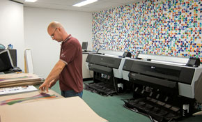
Visitors to Keysborough can’t miss the new brand identity. The logo adorns surfaces outside and in, from business cards to entire walls. The package covers all the collateral; on the day ProPrint visits, Dawson and his team are still pouring over a pile of print in the boardroom, from comp slips to corporate brochures to wrapping paper. The primary colour pattern covers everything, from the reverse of the new stationery to the backs of signage in the car park. One entire side of the pre-press room has been given over to a feature wall that shouts with colour. Dawson admits that after the pre-press paint job, he did wonder whether he’d gone too far. “We don’t want to give anyone a headache,” he jokes.
The new logo was designed by one of Southern Colour’s customers, ERD Communications. The rebranding exercise was driven internally by sales and marketing manager Tony Cosma.
Southern Colour prides itself on being one-stop shop thanks to its arsenal of recent model pre-press, printing, finishing equipment. If the look of the office space is now dominated by the new brand’s contrasting primary hues, the colour scheme in the production hall is distinctly Heidelberg grey. Southern Colour aims to offer clients an end-to-end solution in-house; Dawson approached the rebranding exercise with the same in-house mentality.
They didn’t come up with all the creative elements internally – a decision many printers make, whether by choice or necessity (you know who you are). But Southern Colour remained heavily involved. The vast majority of the collateral has been produced in-house, other than signage, uniforms and embellishments. The website was also developed internally. One of the pre-press staff went on a website design course not too long ago. At the time, Southern Colour contributed to the training cost, not really thinking it would pay off so soon. The upshot is that not only did the company get a flashy new website, but Dawson now sees an opportunity to add web design to Southern Colour’s bag of tricks.
What’s the cost?
But even doing a large chunk in-house, a project this comprehensive can’t have come cheap. How did it tally with the original budget?
“We had to improvise,” admits Dawson. In the end, he couldn’t do it by halves. For instance, he says: “We had painted logos on the walls and we thought we’d just paint over that little area. But then we had a look at it and said ‘that looks a bit silly’ so we painted the next little bit and the next little bit. Suddenly the whole building had been repainted.
“So yes, we went over budget, but we wanted to be really proud of it. We want our staff to be really proud of it.
We want our customers to know they are dealing with a committed and passionate supplier. And I don’t think you can do that if you do it half-baked,” he says.
While Dawson is obviously proud of the new-look Southern Colour, the exercise didn’t come without its own challenges. He repeatedly says the refresh was meant to galvanise staff, so what kind of reception has it had from employees?
“There is a lot of internal buy-in from staff. We have taken them through the process in discussing why we did it. When we first started, there were a few murmurs: why are we spending money on this? What does it mean?”
But the whole team is now onboard. From a customer point of view, he expects that the obviously significant level of investment in branding will reinforce confidence, particularly because it comes at a time when many companies are pulling their heads in.
The Melbourne HQ has been the initial focus, but the look is being extended to the Sydney site as well. If ploughing resources into a rebrand during the current climate looks like a show of strength in the Melbourne market, it should look doubly confident in Sydney: the harbour city has seen a disproportionate number of company failures in the past year.
How do conditions in the two state capitals compare? With operations in both, Dawson has a insight into the differences.
“I have no qualms in saying it has been very tough up there [in Sydney]. Scott and the NSW team have done a remarkable job given the environment,” he says.
But why is it so much worse up north?
“I can’t put my finger on why Sydney has been affected greater than Melbourne. But there has been more pressure in Sydney.”
NSW expansion
Something that helped bolster Southern Colour NSW was the decision to swell the ranks. In April, Southern Colour acquired fellow Sydney printer Macdonald & Masterson, roughly doubling the headcount and shoring up the customer list. Dawson says he and Scott Telfer had been on the lookout for merger possibilities in order “to inject some quality people and customers into New South Wales”.
“Anyone who has been in the trade for a while knows there aren’t a lot of salespeople who can actually deliver consistent sales. It’s a lot tougher now.
“We have attracted some more good people to the business through the Macdonald & Masterson acquisition. They are performing well and the business has steady sales development.”
Merging two companies can be a tricky business, but Southern Colour has a track record of buyouts. Before Macdonald & Masterson, around four years ago Hampton Press was acquired and merged into Keysborough. A couple of years before that, Southern Colour had taken over Excelsior Press. The buyouts have always been about sales and skills, says Dawson.
But where people are involved, there’s always a chance of integration problems. Dawson understands that fusing disparate team cultures requires a strategic approach. It’s not something to be taken lightly.
“You’ve got people who are previously business owners coming into a company with no ownership. That’s the biggest adjustment. We’ve experienced it here with acquisitions over the years and it’s the biggest challenge for people. That provided a few challenges but nothing that team-oriented people couldn’t overcome.
“We’re very, very proud of the team up in NSW and to see the rewards they got on Friday night was terrific.”
He is talking about Southern Colour’s haul at the NSW PICA awards on 5 November. Dawson says the company hadn’t really made an effort with awards in the past, but this year was the ideal time to get involved. The quality of work and effort it put into its entries paid off for the NSW division. Scott Telfer’s team was one of the night’s biggest winners. The company took home three golds, four silvers and three bronzes, surpassed only by perennial awards favourite Offset Alpine.
It could be a watershed moment for the company, showing stability and strength across two states. Dawson says that when people talk about Southern Colour, “we want that to reflect both plants”.
Equipment-wise, the pair of Heidelberg houses are now even more in sync as New South Wales undergoes a pre-press upgrade. And with the new brand in place, troops from both states are rallying under a single banner of strength.
Business Briefing – Rebranding
· It is ironic that many printers who produce quality work for marketing and design clients don’t apply the same quality design to their own internal corporate identity. Signage, stationery and other collateral are all part of a company’s brand.
· In the internet age, the quality of a website is extremely important to business. It is a company’s shopfront to the worldwide web, yet many printers don’t treat it as a priority.
· Print buyers, especially clients in the design, marketing or publishing sectors, respect good design. A strong corporate identity is a sign of corporate commitment, strength and stability.
· While some printers do employ people with design expertise in-house, many fall into the trap of trying to conceive the creative idea internally when this isn’t part of their core skill set.
· There are many branding specialists out there to help with your corporate identity. It is likely most printers already produce print for these types of design houses. Is there scope for a contra to cut the costs of a rebrand?
· When going through a rebranding exercise, be prepared to make the investment. Costs will start to spiral if you include all the different brand collateral. Business cards, letterheads, outdoor and internal signage, uniforms, website – the list goes on.
· Rebranding is an opportunity galvanise the workforce. It should send a message of unity and cohesion throughout the team, so it is important to get buy-in from everyone.
Comment below to have your say on this story.
If you have a news story or tip-off, get in touch at editorial@sprinter.com.au.
Sign up to the Sprinter newsletter